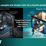
Have you ever walked past an exhibition stall and felt instantly drawn in? Or avoided one without even realizing why?
That’s not random—it’s design psychology at work.
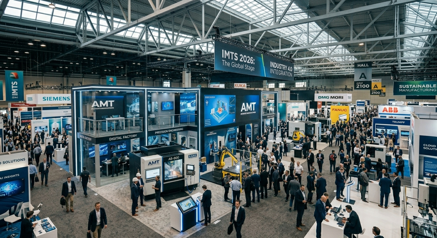
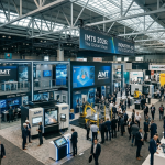
In today’s competitive trade shows and exhibitions, your stall isn’t just a structure. It’s a strategic experience that influences how visitors feel, move, and engage with your brand. The right exhibition stall design can significantly boost visitor engagement, dwell time, and conversions.
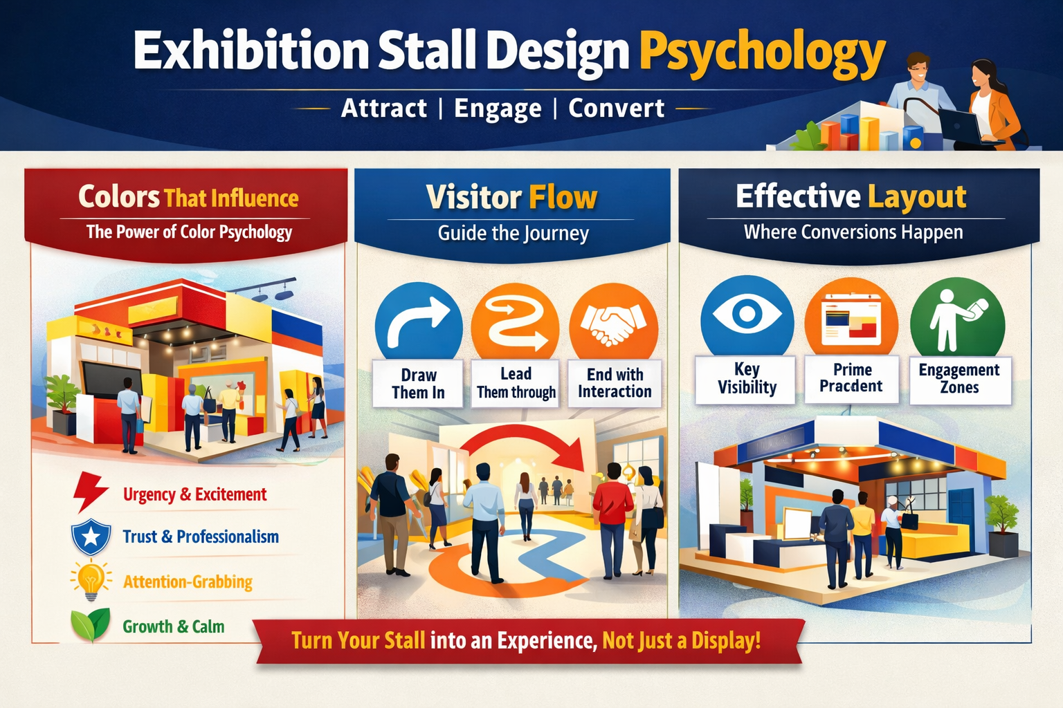
Let’s break down the three key elements that make this happen: color psychology, visitor flow, and stall layout.
1. Color Psychology in Exhibition Stall Design
Colors are more than visual elements—they are powerful triggers of emotion and decision-making.
- Red creates urgency and excitement (ideal for promotions and launches)
- Blue builds trust and professionalism (perfect for corporate and tech brands)
- Yellow grabs attention but should be used carefully to avoid overwhelm
- Green represents growth, sustainability, and calmness
The key to effective color psychology in marketing is alignment. Your color palette should reflect your brand message and the emotion you want your audience to feel.
A mismatch can hurt perception:
- A luxury brand using overly bright colors may lose its premium appeal
- A tech brand with dull tones may fail to build trust
Pro Tip: Your colors should communicate your brand story instantly—before a single conversation begins.
2. Visitor Flow Design: Guiding Movement and Interaction
Ever entered a stall that felt easy to explore—and another that felt confusing?
That’s visitor flow design.
Flow determines:
- How visitors enter your stall
- What they see first
- Where they stop and engage
- How long they stay
A well-planned exhibition booth flow:
- Naturally attracts visitors
- Guides them through a clear journey
- Ends with a strong interaction point (demo, meeting, lead capture)
Poor flow, on the other hand:
- Creates confusion
- Causes crowding or bottlenecks
- Pushes visitors away quickly
Think of your stall as a story—if the journey isn’t smooth, the message gets lost.
3. Exhibition Stall Layout: Turning Interest into Conversions
Your stall layout is where design meets business results.
It defines:
- Product placement
- Engagement zones
- Visibility from a distance
- Ease of interaction
Many brands make a critical mistake—they design for looks, not behavior.
A high-converting exhibition booth layout ensures:
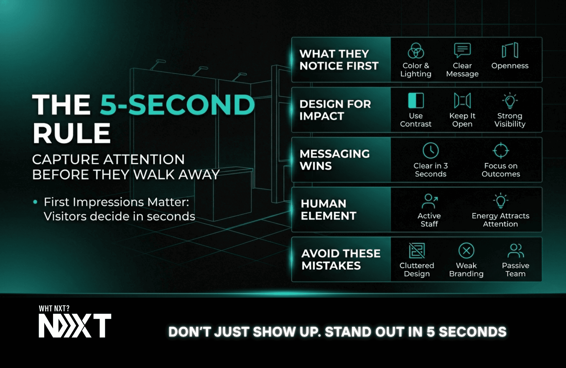
- Key messaging is visible within 3 seconds
- Important products are placed at eye level
- Interaction zones are easy to access
- Staff are visible and approachable
Remember: Visitors avoid effort. If your stall is hard to understand, they’ll simply move on.
Insight: The easier it is to interact with your stall, the higher your conversion rate.
How to Design a High-Converting Exhibition Stall
When colors, flow, and layout work together, your stall becomes an experience—not just a display.
To improve your trade show booth performance:
- Use colors strategically to influence emotions
- Design a clear and intuitive visitor journey
- Focus on interaction, not just aesthetics
- Make your brand message instantly visible
- Always ask: “What should the visitor do next?”
Why Stall Design Matters More Than Ever
With shorter attention spans and intense competition at exhibitions, you only get a few seconds to make an impression.
That’s why strategic stall design is no longer optional—it’s essential.
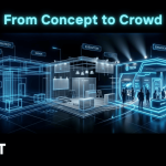
At WhtNxt, we go beyond design. We create psychology-driven exhibition experiences that are built to attract, engage, and convert. From concept to execution, every element is aligned with your business goals.
Final Thought
Your exhibition stall is more than a space—it’s a behavioral trigger.
- Design it right, and it becomes your most powerful sales tool
- Design it wrong, and it gets lost in the crowd
So the next time you plan your exhibition presence, don’t just ask:
“How will it look?”
Ask:
“How will it make people feel, move, and act?”
Planning Your Next Exhibition?
If you want a high-converting exhibition stall design that delivers real results—
Think beyond design. Think WhtNxt.

Leave a comment
Your email address will not be published. Required fields are marked *